Project details

Budget:

E-Commerce

Client:

Shelby S

Tool:

Figma

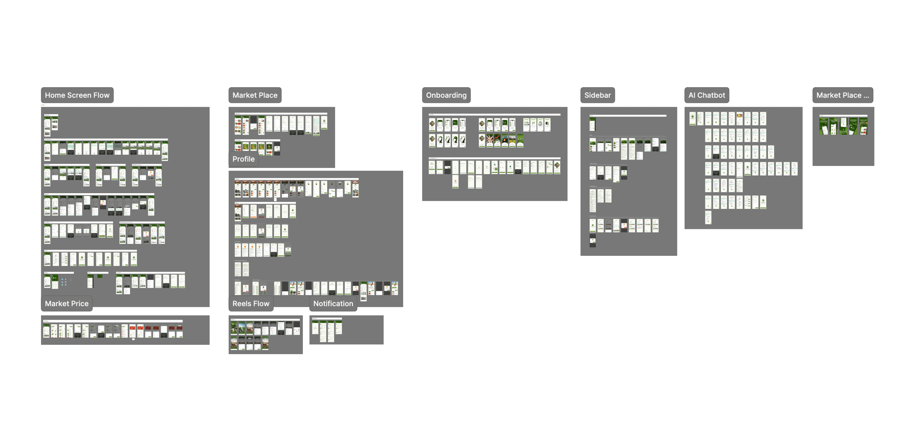
Agrigate Network Limited | A Modern Agricultural Marketplace & Community Platform


Project Goal

Agrigate Network Limited aimed to build a powerful digital ecosystem that empowers rural communities to sell their pure agricultural products online. The platform also serves general users who want to browse, compare, and purchase items easily.

Key objectives included:

  • Enable rural farmers to upload and sell authentic agricultural goods.

  • Offer a clean, structured marketplace for buyers.

  • Provide daily market price updates for all agricultural products.

  • Allow users to share daily farming updates through a social media-style feed.

  • Integrate loan application features directly inside the app.

  • Introduce AI-driven tools for price comparison, daily rates, and weather guidance.

The core mission was to make agricultural commerce simple, transparent, and accessible for everyone.


Problem

When I started working on the project, the app was already built, but the experience was very poor. The UI looked old and unorganized, and the overall flow didn’t follow any UX structure. There was no design system, no documentation, and features were scattered everywhere. Users had difficulty finding what they needed, farmers couldn’t upload products smoothly, and overall the app felt messy and confusing. The biggest challenge was that everything needed to be redesigned from scratch in a proper, structured way.

Solution

I first analyzed the entire app and documented all the UX problems. After understanding what wasn’t working, I reorganized the full structure of the product and planned clear user flows for every type of user. Then I moved to Figma and created user journeys, user flows, and eventually built a complete design system for colors, spacing, components, and layout rules.

Once the foundation was ready, I started designing high-fidelity screens that looked clean, modern, and simple to use. I removed unnecessary elements, made the interface more focused, and improved the style to make the app feel more fluid and professional. Throughout the process, I worked closely with the development team to ensure every detail could be delivered exactly as designed. After several iterations, the final design got approved.

Success Outcome

The redesigned app got a very positive response. Everyone in the company liked the new version and agreed that it improved a lot compared to the old one. Around 80% of the users said they were happy with the new experience. People are now using the app comfortably, finding what they need easily, and enjoying the smoother flow. Farmers especially can now upload and sell their products without any confusion, which was one of the biggest goals of this project.


Key Takeaways

This project taught me how a product is built from start to finish, how to properly follow a UX process, and how to communicate with a development team to solve issues. I learned how to gather feedback from users, handle conflicts in a product team, and design a modern, clean interface that feels natural to use.

Create a free website with Framer, the website builder loved by startups, designers and agencies.