Project details

Budget:
Video Streaming
Client:
Shelby S
Tool:
Figma
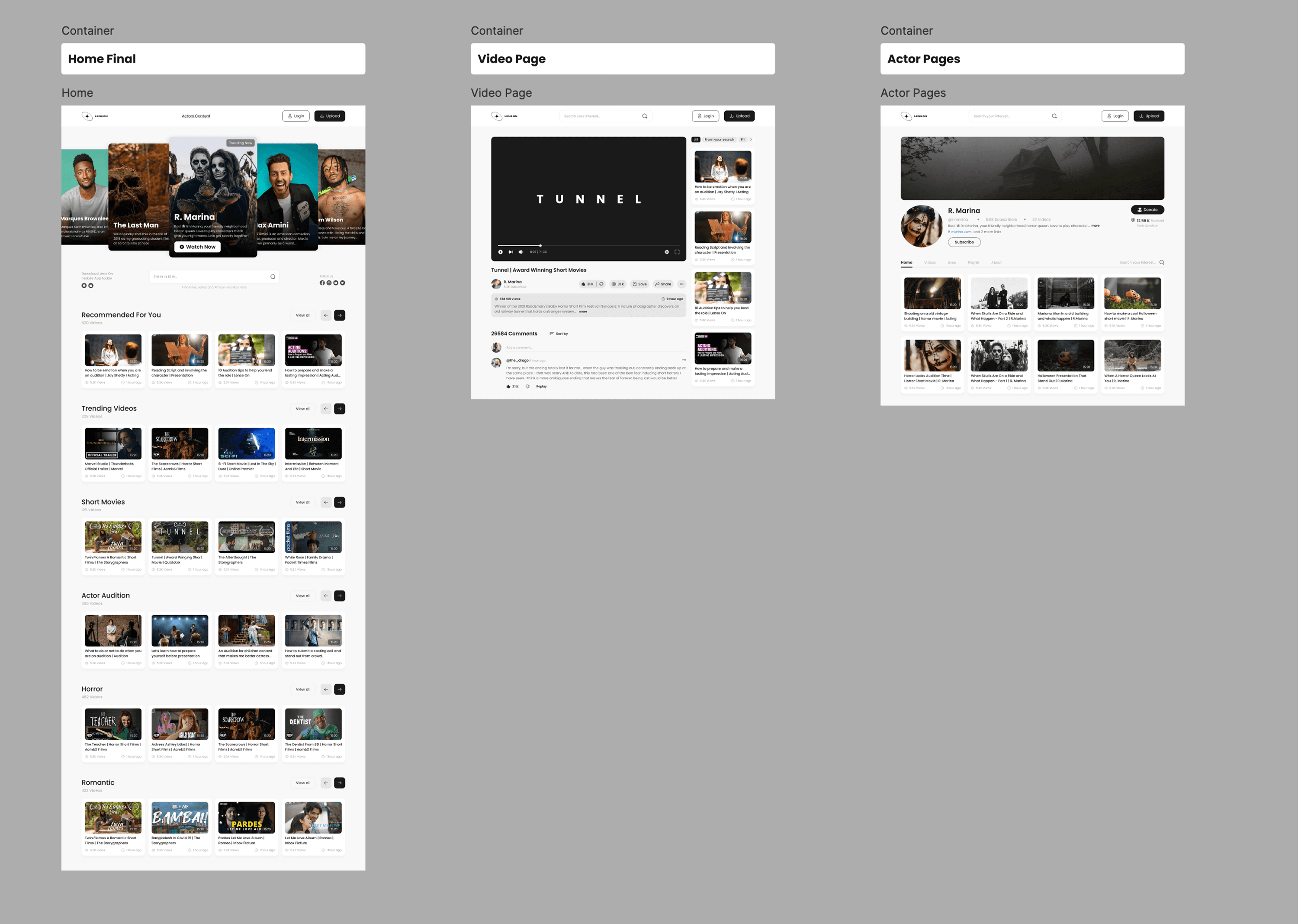
Lens ON | A Platform for all kind of actor.
Project Goal
Lens ON is a platform designed to give actors a space to show their short movies, stories, and posts in a style that feels like a mix between Netflix and YouTube. The idea was to make a place where people can watch actors, follow their creative journey, and even donate a small amount to support their career. The entire goal of the project was to create a simple website design that clearly presents videos, short content, and posts in a clean and modern way so actors can get visibility and viewers can support them easily.


Problem
The client wanted something similar to Netflix and YouTube but not exactly like them. Their audience was different, and the platform needed its own unique identity. The biggest challenge was creating a space where short stories, short films, and Instagram-style posts could all live together without looking confusing or copied from other platforms. They also wanted a donation feature that lets users directly support actors, which is not a common feature on typical streaming websites. With only a short description from the client, the main difficulty was understanding their vision and turning it into a well-structured product.
Solution
I started by analyzing how Instagram, YouTube, and Netflix work—their structure, content formatting, and how users move through the platforms. Then I focused on what should be different for Lens ON and how to make it fit the client’s unique audience. I wrote a clear document explaining how the platform would work, created user stories to understand what people would do inside the site, and defined all the major features. After that, I worked on the user journey and user flow to build a smooth experience. I created a simple style guide to keep the visuals consistent and then moved into the actual design phase. The final result was a clean, modern layout that showcased videos and posts beautifully and supported the donation features the client wanted.

Success Outcome
The client was extremely happy with the final product. They did not expect the idea to turn into a full website design from such a short description, and they appreciated how clearly everything was organized. They gave me a 5-star rating along with a great review, and the design helped them bring their concept to life in a professional way.
Key Takeaways
This project increased my confidence in working with international clients. I learned how to understand and build a complete product from a very small amount of information. It helped me improve my communication, sharpen my understanding of UX/UI terms related to website design, and become more confident in creating style guides and structuring web experiences from scratch.